# List of distributions in base R
?Distributions27 Distributions
The main purpose of this chapter is to introduce the necessary background for modeling data. We will introduce the three base distributions used in modeling: normal, binomial, and Poisson.
The distributions built into base R can be found using
Most distributions have 4 functions:
- d
: probability mass/density function - p
: cumulative distribution function - q
: quantile function (inverse of the cdf) - r
: random draws
library("tidyverse"); theme_set(theme_bw())── Attaching core tidyverse packages ──────────────────────── tidyverse 2.0.0 ──
✔ dplyr 1.1.4 ✔ readr 2.1.5
✔ forcats 1.0.0 ✔ stringr 1.5.1
✔ ggplot2 3.5.1 ✔ tibble 3.2.1
✔ lubridate 1.9.3 ✔ tidyr 1.3.1
✔ purrr 1.0.2
── Conflicts ────────────────────────────────────────── tidyverse_conflicts() ──
✖ dplyr::filter() masks stats::filter()
✖ dplyr::lag() masks stats::lag()
ℹ Use the conflicted package (<http://conflicted.r-lib.org/>) to force all conflicts to become errorslibrary("MASS") # for fractions()
Attaching package: 'MASS'

The following object is masked from 'package:dplyr':

selectlibrary("scales") # for breaks_pretty()
Attaching package: 'scales'

The following object is masked from 'package:purrr':

    discard

The following object is masked from 'package:readr':

    col_factor
# Set seed to figures are not regenerated
set.seed(20240229)27.1 Discrete distributions
Discrete distributions have a finite or countably infinite (countable) support.
27.1.1 Binomial
A binomial random variable is a model for the number of successes \(Y\) out of some number of attempts \(n > 0\) (integer) where each attempt is independent and each has the same probability of success \(0 < p < 1\). Independent means that the results of previous attempts does not change the probability of the current attempt.
To denote a binomial random variable, we write \(Y \sim Bin(n,p)\). The image of a binomial random variable are the integers from \(0\) up to \(n\).
# Y ~ Bin(10, 1/3)
n <- 10
p <- 1/3
27.1.1.1 Moments
The expected value (or mean) of a random variable is the average value over an infinite number of realizations of the random variable. For a binomial random variable, expected value is \(E[Y] = np\).
# Binomial mean
n*p
[1] 3.333333The variance of a random variable is the average squared deviation of the random variable from its mean. For a binomial random variable, the variance is \(Var[Y] = np(1-p)\).
# Binomial variance
n*p*(1-p)
[1] 2.222222While the variance is mathematically convenient, e.g. the variance of the sum of two independent random variables is the sum of the variances, the variance is not easily interpreted since the units are squared. Thus, we will often calculate the standard deviation, which is the square root of the variance, instead.
# Binomial standard deviation
sqrt(n*p*(1-p))
[1] 1.49071227.1.1.2 Probability mass function
The probability mass function (pmf) exists for discrete random variables and can be used to calculate the probability the random variable is exactly equal to a particular value.
Mathematically, the probability mass function for a binomial random variable is \[ P(Y=y) = {n\choose y} p^y (1-p)^{n-y}, \quad y = 0, 1, \ldots, n. \]
In R, the binomial probability mass function is implemented in the dbinom() function.
# Binomial pmf calculation
dbinom(3, size = n, prob = p) # P(Y = 3)
[1] 0.2601229dbinom(6, size = n, prob = p) # P(Y = 6)[1] 0.0569019Here we visualize the binomial probability mass function.
# Binomial pmf plot
d <- data.frame(
  y = 0:n # integers from 0 to n
) |>
  mutate(pmf = dbinom(y,
                      size = n,
                      prob = p),

         # For displaying later
         is3      = y == 3,
         in_range = y >= 2 & y <= 5
         )

g <- ggplot(d,
       aes(x    = y,
           y    = pmf,
           yend = 0,
           xend = y)) +
  geom_point() +
  geom_segment() +
  scale_x_continuous(breaks = breaks_pretty()) +
  labs(
    title = paste0("Probability Mass Function, Bin(", n, ", ", fractions(p), ")"),
    y     = "Probability"
  )

g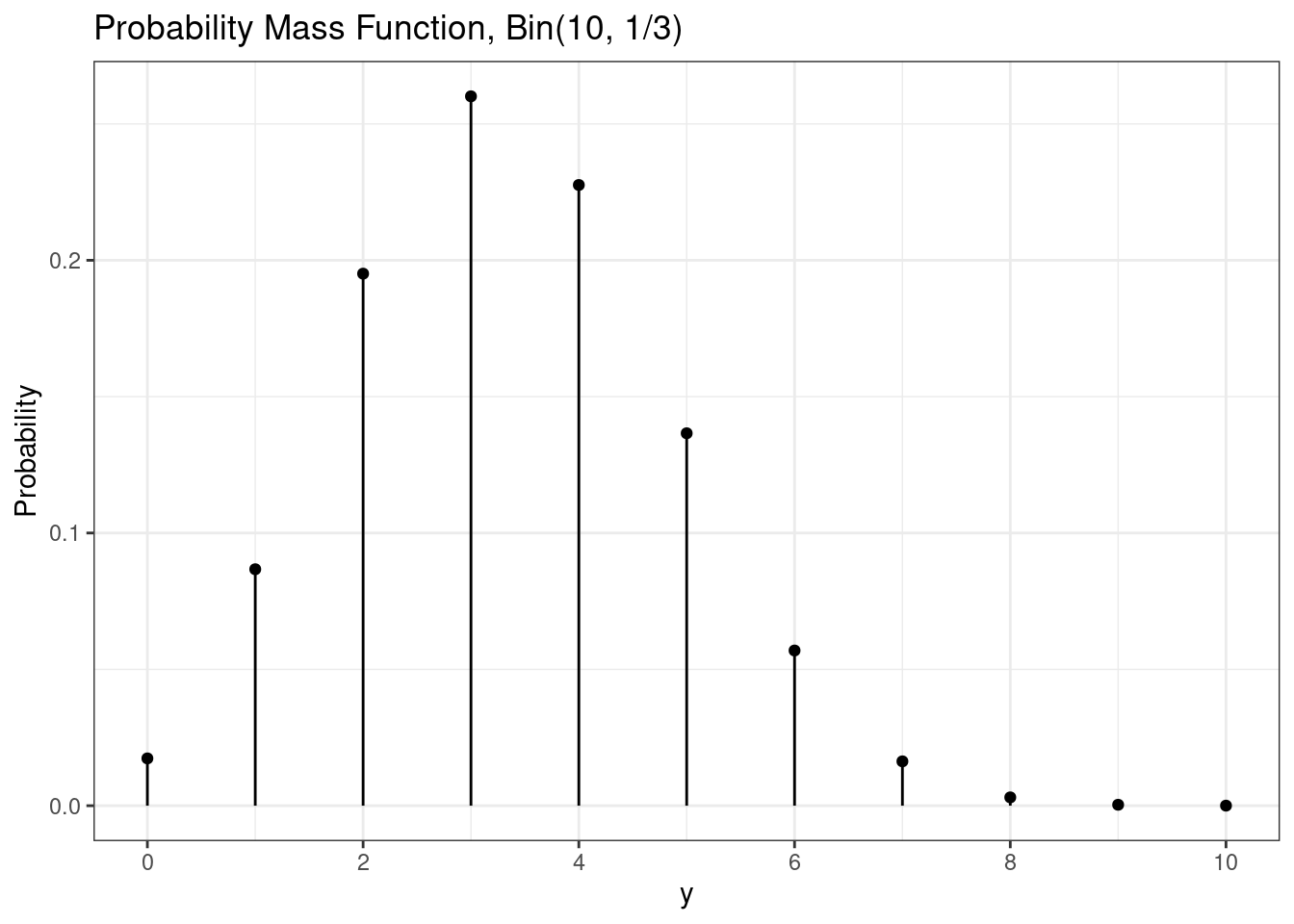
The expected value is the point where the probability mass function will perfectly balance.
g + annotate(geom  = "point",
             x     = n*p,
             y     = 0,
             shape = 17,
             color = "red",
             size  = 2)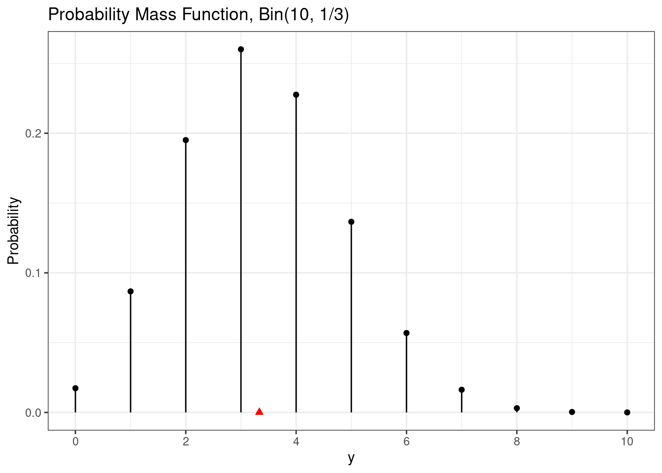
Probabilities can be calculated using the probability mass function. For example, we can calculate \(P(Y = 3)\).
# Binomial probability of single value
g +
  geom_point(  mapping = aes(color = is3)) +
  geom_segment(mapping = aes(color = is3))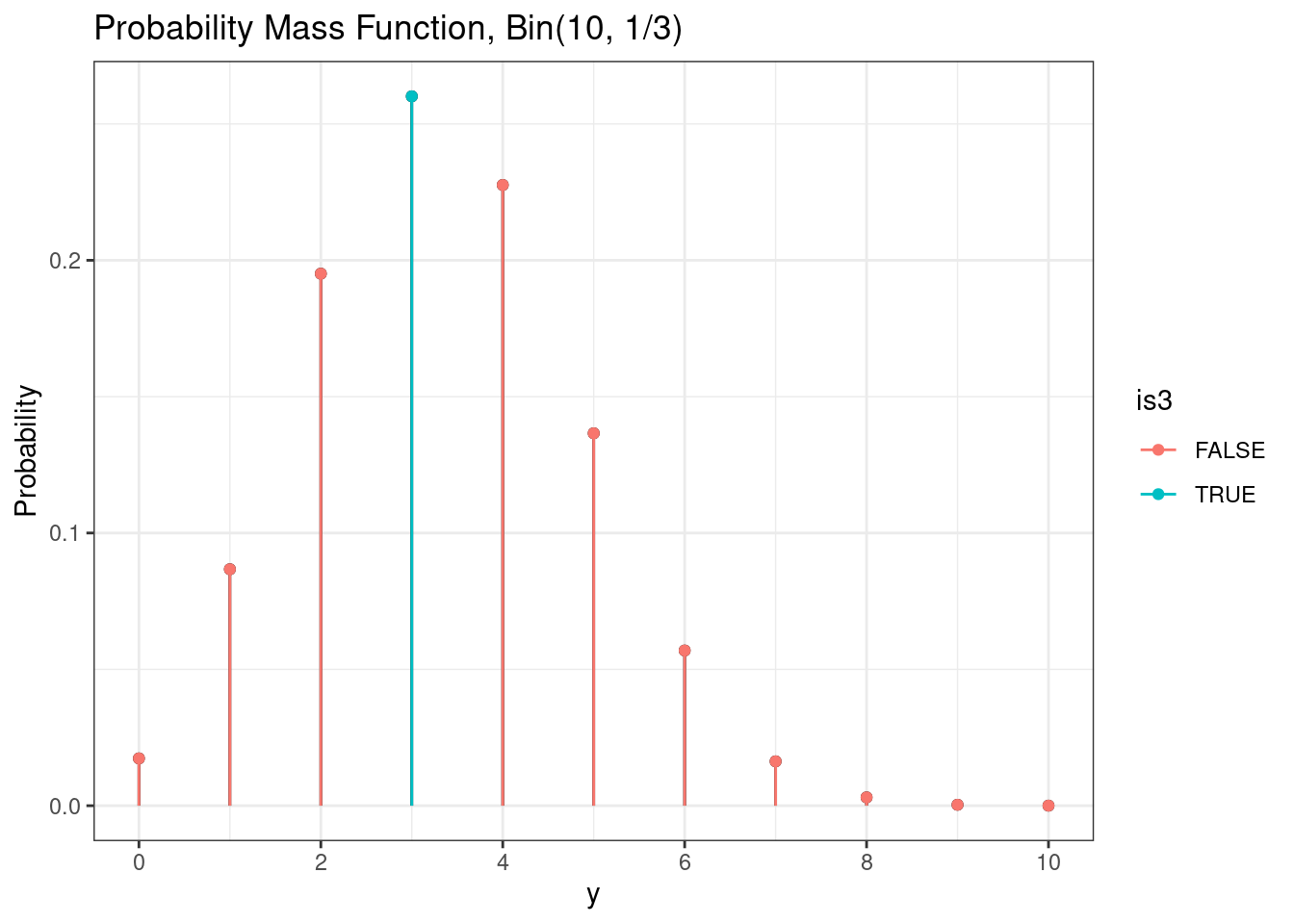
As seen previously, we can calculate the exact value of this probability using the probability mass function.
# Binomial probability of a single value
dbinom(3, size = n, prob = p)
[1] 0.2601229We can also visualize the probability of a range of values, e.g. \(P(2 \le Y \le 5)\).
# Binomial probability of range
g +
  geom_point(  mapping = aes(color = in_range)) +
  geom_segment(mapping = aes(color = in_range))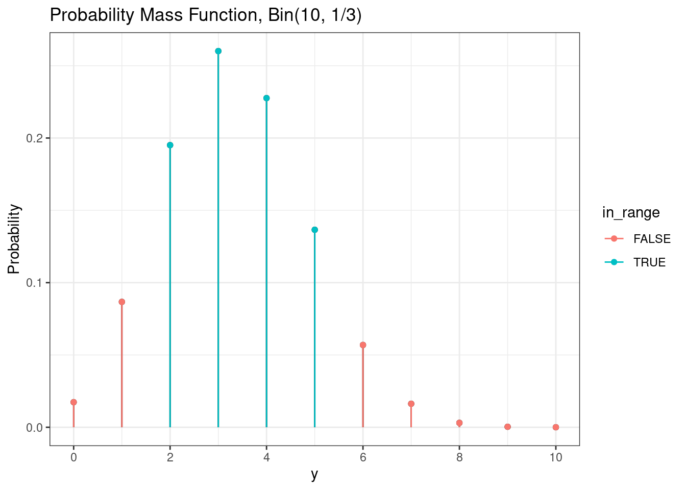
We can calculate the exact value of this probability using the probability mass function.
# Binomial probabiliy of range
sum(dbinom(2:5, size = n, prob = p))
[1] 0.819387327.1.1.3 Cumulative distribution function
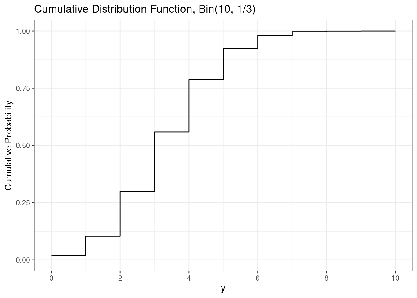
The cumulative distribution function (cdf) is the probability a random variable is less than or equal to a particular value, e.g. \(P(Y \le y)\). The cumulative distribution function is the sum of all of the probability mass function values up to and including \(y\), i.e. \[ P(Y\le y) = \sum_{x=0}^y P(Y = x) = \sum_{x=0}^y {n\choose y} p^y (1-p)^{n-y}. \]
In R, the binomial cumulative distribution function is implemented in the function pbinom().
# Binomial cdf
pbinom(3, size = n, prob = p)     # P(Y <= 3)
[1] 0.55926431 - pbinom(6, size = n, prob = p) # P(Y > 6) = 1-P(Y <= 6)[1] 0.01966164pbinom( 5, size = n, prob = p) - # P(2 <= Y <= 5)
pbinom(1, size = n, prob = p)[1] 0.8193873Here we can visualize the binomial cumulative distribution function.
# Binomial cdf plot
d <- d |>
  mutate(cdf = pbinom(y,
                      size = n,
                      prob = p))

ggplot(d,
       aes(x    = y,
           y    = cdf,
           yend = 0,
           xend = y)) +
  geom_step() +
  scale_x_continuous(breaks = breaks_pretty()) +
  labs(
    title = paste0("Cumulative Distribution Function, Bin(", n, ", ", fractions(p), ")"),
    y     = "Cumulative Probability"
  )
For discrete random variables, we need to be very careful with our use of inequalities in probability calculations. For example, suppose \(Y \sim Bin(30, 0.4)\) and we want to calculate \(P(10<Y<14)\). Recall that \[ P(10<Y<14) = P(Y\le 13) - P(Y \le 10) \] we can do this using
# Binomial probability calculation
# Y ~ Bin(30, 0.4)
# P(10 < Y < 14) = P()
n <- 30
p <- 0.4

# Using pmf
sum(dbinom(11:13, size = n, prob = p))
[1] 0.4230325# Using cdf
pbinom(13, size = n, prob = p) -
pbinom(10, size = n, prob = p)[1] 0.423032527.1.1.4 Random draws
To obtain random draws from a binomial use the rbinom function.
# Binomial one random draw
rbinom(1, size = n, prob = p)
[1] 8It is often helpful to utilize random draws to visualize variability in a random variable.
# Binomial random draws
draws <- rbinom(1000,
                size = n,
                prob = p)

ggplot(mapping = aes(x = draws)) +
  geom_histogram(binwidth = 1)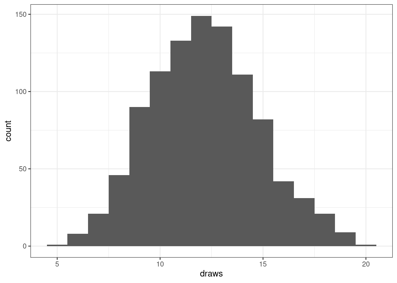
In the Monte Carlo module, we will utilize random draws to estimate quantities. For example, let’s use these random draws to estimate the probability of the random variable being between 10 and 14 (excluding both endpoints).
# Binomial Monte Carlo estimate
mean(10 < draws & draws < 14)    # calculate proportion of draws
[1] 0.424pbinom( 13, size = n, prob = p) -
pbinom(10, size = n, prob = p)[1] 0.423032527.1.2 Poisson
A Poisson random variable can be used to model the number of occurrences of a ‘rare’ event over some amount of space or time where the events are occurring at a constant rate \(\lambda > 0\) and the time between events is independent.
To denote a Poisson random variable, we write \(X \sim Po(\lambda)\).
# Poisson random variable
# X ~ Po(2.9)
r <- 2.9 # rate
27.1.2.1 Moments
A key feature of the Poisson random variable is its mean and variance are both equal to its rate. For a binomial random variable, expected value is \(E[X] = Var[X] = \lambda\).
# Poisson moments
r       # mean
[1] 2.9r # variance[1] 2.9sqrt(r) # standard deviation[1] 1.70293927.1.2.2 Probability mass function
The probability mass function for a Poisson random variable is \[ P(X=x) = \frac{e^{-r}r^x}{x!}, \quad x = 0, 1, 2, \ldots. \]
The probability mass function for a Poisson random variable can be evaluated using the dpois() function.
# Poisson pmf
dpois(2, lambda = r) # P(X = 2)
[1] 0.2313726dpois(5, lambda = r) # P(X = 5)[1] 0.09404912A Poisson random variable has a countably infinite image, but we cannot plot an infinite number of probabilities. Thus, we need to choose an upper endpoint for plotting purposes.
# Poisson pmf plot
d <- data.frame(y = 0:(ceiling(4*r))) |>
  mutate(pmf = dpois(y, lambda = r),
         cdf = ppois(y, lambda = r))

ggplot(d, aes(x    = y,
              y    = pmf,
              xend = y,
              yend = 0)) +
  geom_point() +
  geom_segment() +
  scale_x_continuous(breaks = breaks_pretty()) +
  labs(
    title = paste0("Probability Mass Function, Pois(", r, ")"),
    y     = "Probability"
  ) +
  annotate(geom = "point",
           x = r,
           y = 0,
           shape = 17,
           color = "red",
size = 2) 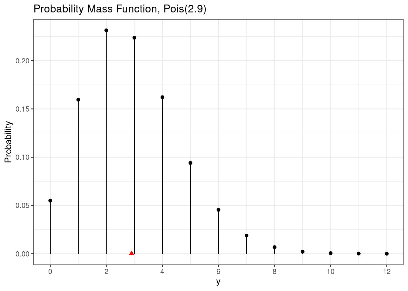
27.1.2.3 Cumulative distribution function
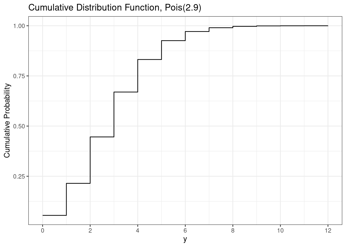
Similar to the binomial, the cumulative distribution function for a Poisson random variable is the probability of the random variable being less than or equal to a particular value, e.g. \(P(X \le x)\). This can be calculated by summing all the values less than or equal to \(x\), i.e. \[ P(X\le x) = \sum_{y=0}^x P(X = y) = \sum_{y=0}^x \frac{e^{-r}r^y}{y!} = e^{-r} \sum_{y=0}^x \frac{r^y}{y!}. \]
To calculate the poisson cumulative distribution function in R, we use the ppois() function.
# Poisson cdf
ppois(3, lambda = r) # P(X <= 3)
[1] 0.6696234ppois(6, lambda = r) # P(X <= 5)[1] 0.9712833Similar to the Poisson probability mass function, we cannot plot the cumulative distribution function for the infinite values the Poisson could be. Instead, we plot only up to where the cumulative distribution function is approximately 1.
# Poisson cdf plot
ggplot(d, aes(x = y, y = cdf)) +
  geom_step() +
  scale_x_continuous(breaks = breaks_pretty()) +
  labs(
    title = paste0("Cumulative Distribution Function, Pois(", r, ")"),
    y     = "Cumulative Probability"
) 
27.1.2.4 Random draws
To obtain random draws from a Poisson distribution use the rpois() function.
draws <- rpois(1000, lambda = r)

ggplot(mapping = aes(x = draws)) +
  geom_histogram(binwidth = 1, color = "white") +
  scale_x_continuous(breaks = breaks_pretty())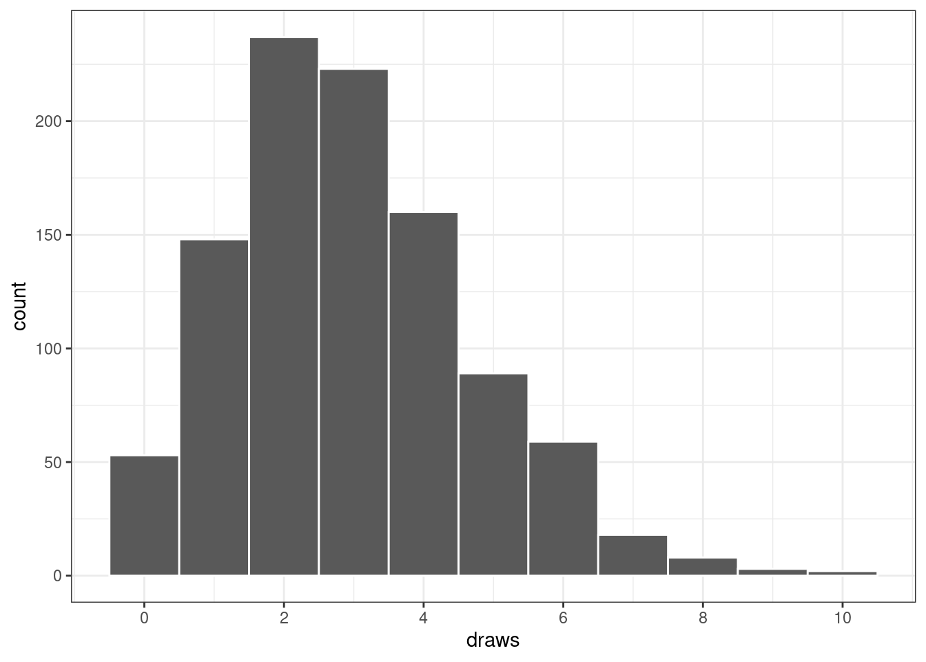
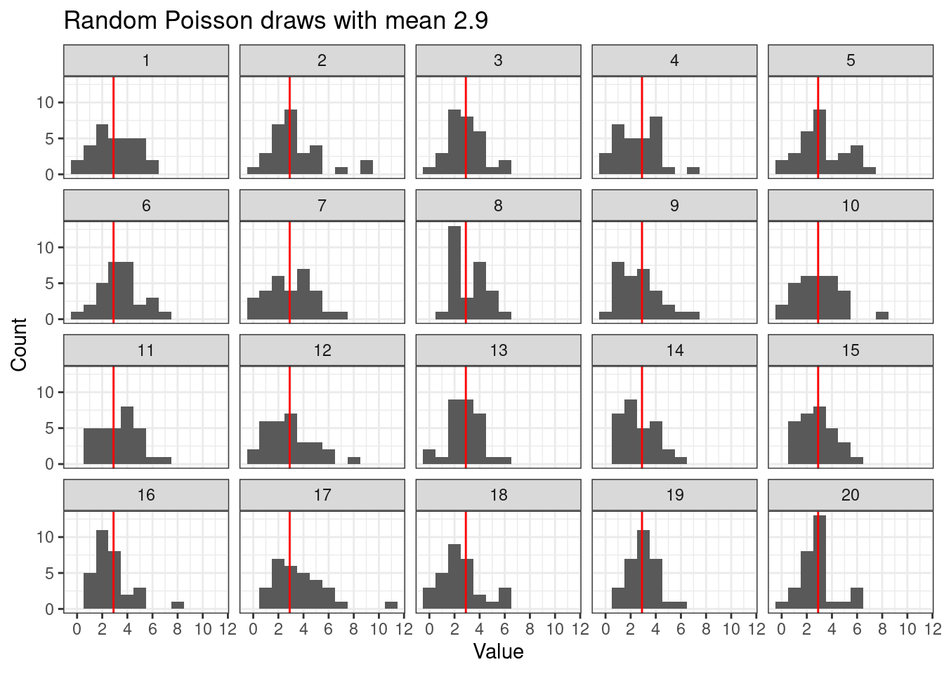
Plotting random draws using facets helps visualize the variability amongst Poisson random draws of the same size. Here we are assuming \[ X_i \stackrel{ind}{\sim} Po(\lambda), \quad i = 1,\ldots,n \]
# Poisson random replicate
n      <- 30 # number of Poisson draws
n_reps <- 20 # number of time to repeat the process

draws  <- data.frame(
  x   = rpois(n * n_reps, lambda = r),
  rep = rep(1:n_reps, each = n)
)

ggplot(draws,
       aes(x = x)) +
  geom_histogram(binwidth = 1) +
  geom_vline(xintercept = r, color = "red") +
  facet_wrap(~rep)  +
  scale_x_continuous(breaks = breaks_pretty()) +
  labs(
    title = paste0("Random Poisson draws with mean ", r),
    y     = "Count",
    x     = "Value"
  )
27.2 Continuous distributions
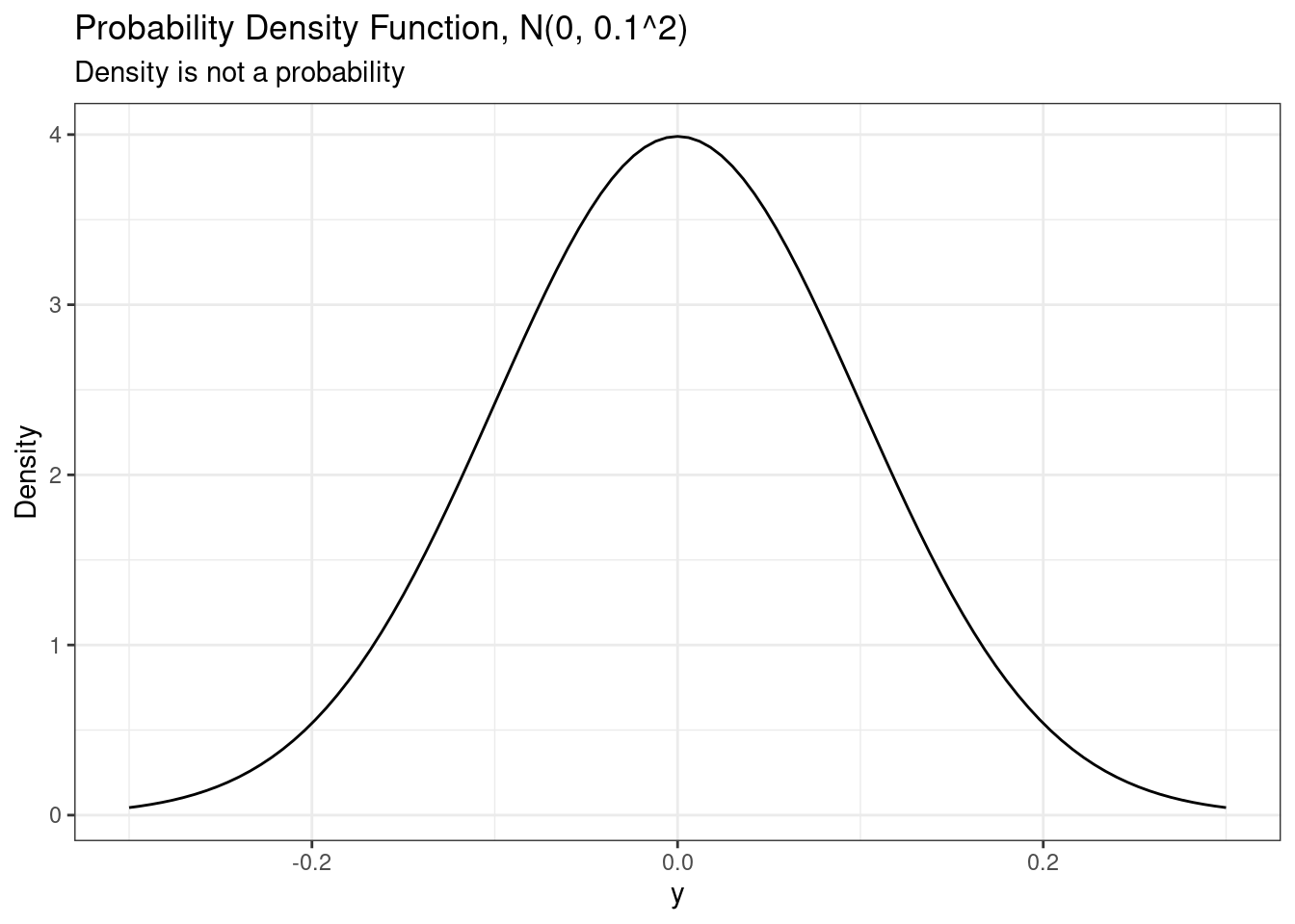
A continuous random variable has an uncountably infinite, or uncountable, image. Therefore the probability of any particular value for a continuous random variable is 0. Thus continuous random variables do not have a probability mass function, but instead have a probability density function.
27.2.1 Normal (Gaussian)
A normal distribution is often used for modeling continuous data. It is the basis of the one-, two-, and paired t-tests as well as the basis for (linear) regression.
To denote a normal random variable, we use \(Y \sim N(\mu, \sigma^2)\) where \(\mu\) is the mean parameter, \(\sigma^2\) is the variance parameter, and \(\sigma > 0\) is the standard deviation parameter.
A standard normal random variable has \(\mu = 0\) and \(\sigma^2 = 1\). Any other random variable can be standardized by subtracting its mean \(\mu\) and dividing by its standard deviation \(\sigma\). Thus, \[ Z = \frac{Y-\mu}{\sigma} \sim N(0,1). \]
# Normal parameters
# Y ~ N(2, 3^2)
mu    <- 2
sigma <- 3 # standard deviation
27.2.1.1 Moments
Since the parameters for a normal distribution derive direction from its moments, they are amongst the easiest to remember. Specifically \(E[Y] = \mu\), \(Var[Y] = \sigma^2\), and \(SD[Y] = \sigma\).
# Normal moments
mu      # mean
[1] 2sigma^2 # variance[1] 9sigma # standard deviation[1] 3The mean is the point at which the probability density function perfectly balances.
27.2.1.2 Probability density function
The normal probability density function is the well-known ``bell-shaped curve.’’ Mathematically, the pdf is \[ f(y) = \frac{1}{\sqrt{2\pi\sigma^2}} \exp\left( - \frac{1}{2\sigma^2}(y-\mu)^2\right), \quad -\infty < y < \infty. \]
In R, we can use the dnorm() function to evaluate the normal probability density function.
# Normal pdf
# Construct data and evaluate the pdf (and cdf)
d <- data.frame(x = seq(from   = mu - 3*sigma,
                        to     = mu + 3*sigma,
                        length = 1001)) |>
  mutate(pdf = dnorm(x, mu, sigma),
         cdf = pnorm(x, mu, sigma))

# Plot the pdf
ggplot(d, aes(x = x,
              y = pdf)) +
  geom_line() +
  scale_x_continuous(breaks = breaks_pretty()) +
  labs(
    title = paste0("Probability Density Function, N(", mu,", ", sigma^2, ")"),
    y     = "Density",
    x     = "y"
  ) +
  annotate(geom = "point",
           x = mu,
           y = 0,
           shape = 17,
           color = "red",
size = 2) 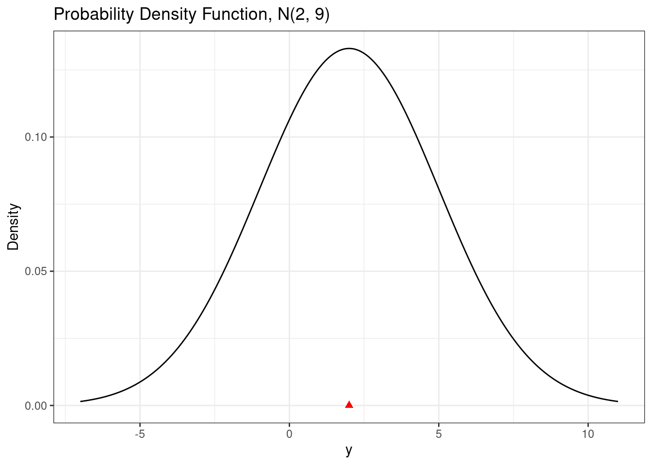
# A PDF is not a probability
ggplot(data.frame(x = c(-0.3, 0.3)),
       aes(x = x)) +
  stat_function(fun = dnorm,
                args = list(
                  mean = 0,
                  sd   = 0.1
                ))  +
  labs(
    title = paste0("Probability Density Function, N(0, 0.1^2)"),
    subtitle = "Density is not a probability",
    y     = "Density",
    x     = "y"
  )
Areas under the probability density function provide probabilities. For example, if we want to calculate the probability of being between 0 and 5, i.e. \(P(0 < Y < 5)\), we can calculate the area under the probability density function. The area will look like the following graph.
# Using a different method to plot pdf
ggplot(data.frame(x = c(mu - 3*sigma,
                        mu + 3*sigma)),
       aes(x = x)) +

  # Plot the area
  stat_function(fun = dnorm,
                xlim = c(0, 5), # P(0 < Y < 5)
                args = list(
                  mean = mu,
                  sd   = sigma
                ),
                geom = "area",  # Fill area under curve
                fill = "red") +

  # Put the main density last so black line is visible
  stat_function(fun = dnorm,
                args = list(
                  mean = mu,
                  sd   = sigma
                )) +
  scale_x_continuous(breaks = breaks_pretty()) +
  labs(
    title = paste0("Probability Density Function, N(", mu,", ", sigma^2, ")"),
    y     = "Density",
    x     = "y"
  )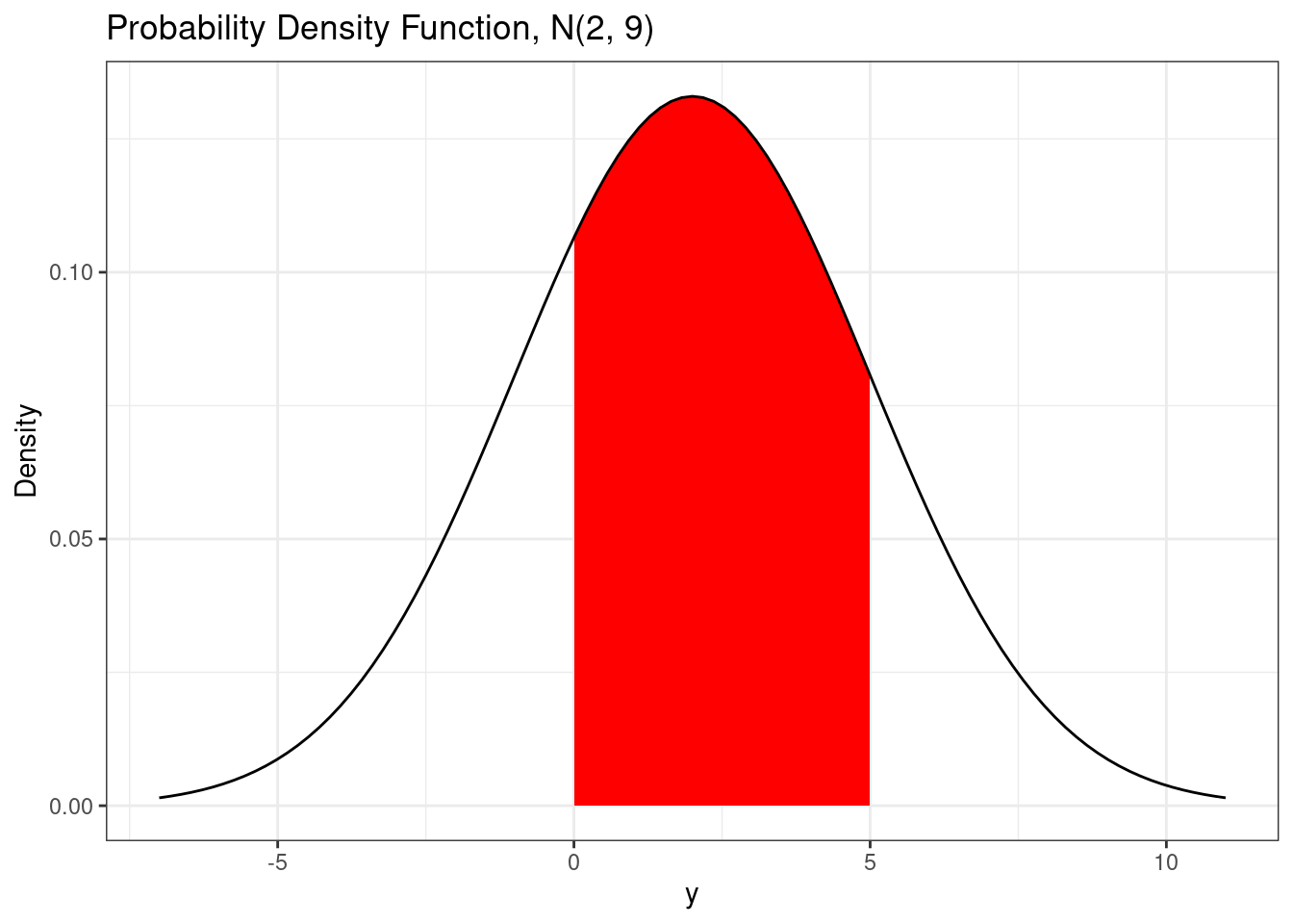
The area under the curve is also called the integral. If you want the numerical value of this area, you can use the integrate() function.
# Integrate pdf
integrate(dnorm,
          lower = 0,
          upper = 5,
          mean  = mu,
          sd    = sigma)
0.5888522 with absolute error < 6.5e-15When calculating these probabilities, an alternative is to use the cumulative distribution function.
27.2.1.3 Cumulative distribution function
Just like for discrete random variables, the cumulative distribution function for continuous random variables is the probability that the random variable is less than or equal to a particular value, i.e. \(P(Y \le y)\). Since continuous random variables have probability 0 of being equal to any particular value, we have \(P(Y \le y) = P(Y < y)\).
# Using a different method to plot pdf
ggplot(data.frame(x = c(mu - 3*sigma,
                        mu + 3*sigma)),
       aes(x = x)) +

  # Plot the area
  stat_function(fun = dnorm,
                xlim = c(mu - 3*sigma, 3), # P(Y < 3)
                args = list(
                  mean = mu,
                  sd   = sigma
                ),
                geom = "area",  # Fill area under curve
                fill = "red") +

  # Put the main density last so black line is visible
  stat_function(fun = dnorm,
                args = list(
                  mean = mu,
                  sd   = sigma
                )) +
  scale_x_continuous(breaks = breaks_pretty()) +
  labs(
    title = paste0("Probability Density Function, N(", mu,", ", sigma^2, ")"),
    y     = "Density",
    x     = "y"
  )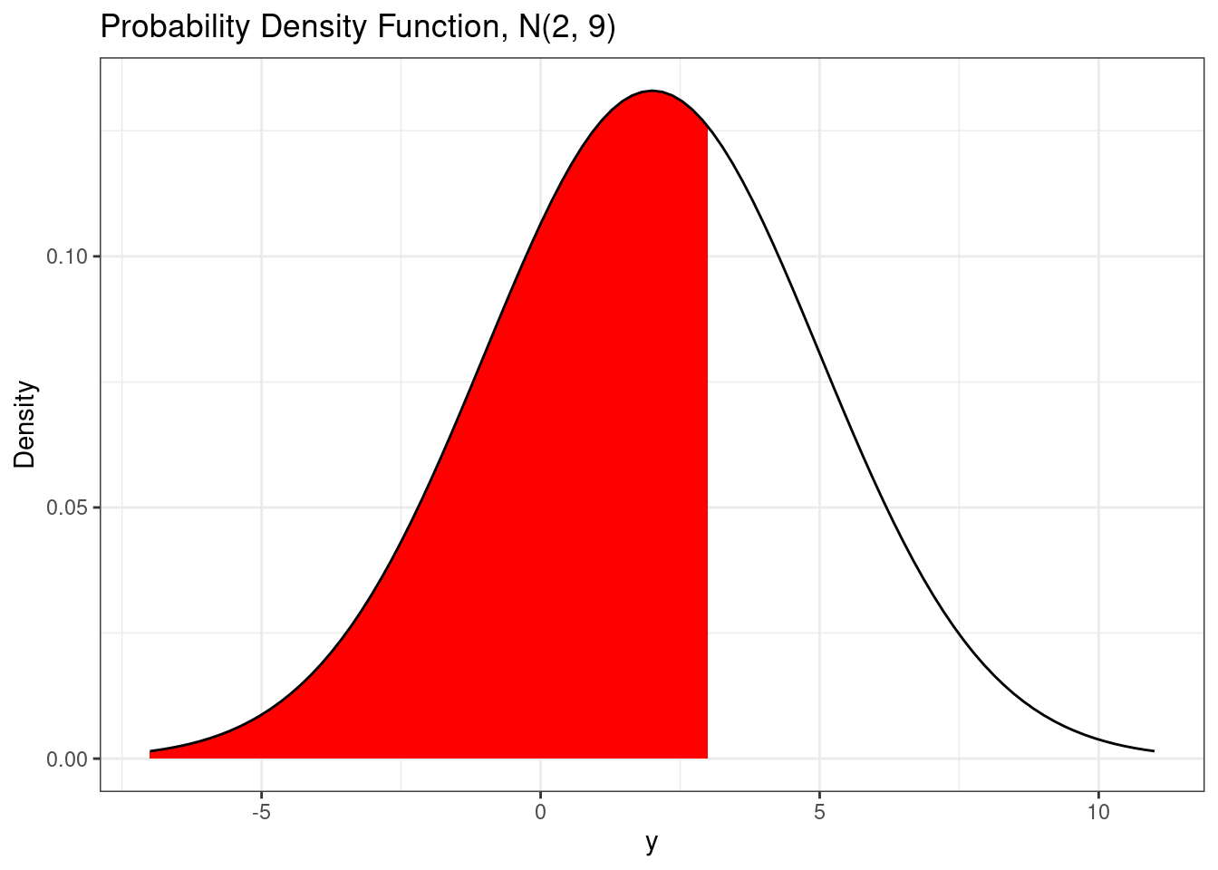
The cumulative distribution function for a normal random variable has no analytic form. There are good approximation of the normal cumulative distribution function that can be used for plotting purposes. The normal cumulative distribution function is implemented in the pnorm() function.
# Normal cdf
pnorm(3, mean = mu, sd = sigma)     # P(Y < 3)
[1] 0.63055871-pnorm(3, mean = mu, sd = sigma) # P(Y > 3) = 1 - P(Y < 3)[1] 0.3694413pnorm( 5, mean = mu, sd = sigma) -
pnorm(0, mean = mu, sd = sigma) # P(0 < Y < 5)[1] 0.5888522# Normal cdf plot
ggplot(d, aes(x = x, y = cdf)) +
geom_line() +
scale_x_continuous(breaks = breaks_pretty()) +
labs(
title = bquote('Cumulative Distribution Function: N('~.(mu)~','~.(sigma)^2~')'),
y = "Probability",
x = "y"
) +
annotate(geom = "point",
x = mu,
y = 0,
shape = 17,
color = "red",
size = 2) 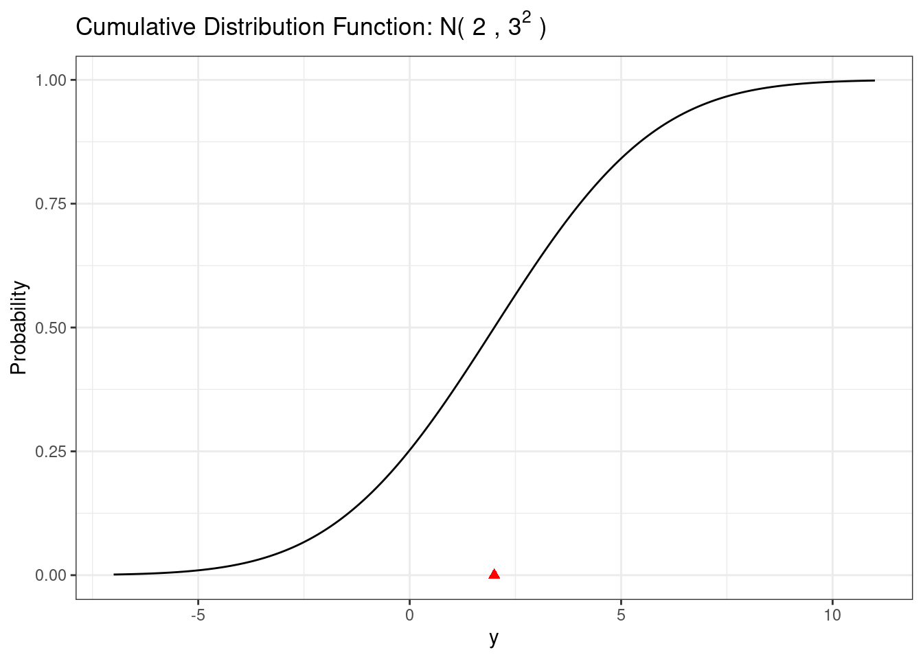
27.2.1.4 Critical values
The qnorm function provides the inverse of the normal CDF. We can plot this function using the qnorm() function.
# Normal quantile function
ggplot(data.frame(p = 0:1)) +
  stat_function(fun = qnorm,
                n = 1001,
                args = list(mean = mu,
                            sd   = sigma))  +
  scale_x_continuous(breaks = breaks_pretty()) +
  labs(
    title = bquote('Quantile Function: N('~.(mu)~','~.(sigma)^2~')'),
    y     = "y",
    x     = "Probability"
  )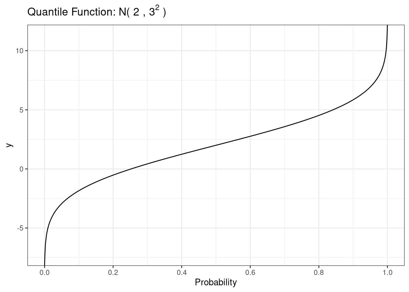
The most common use of this function is to obtain z critical values for use in constructing confidence intervals.
# Normal critical values
alpha <- 0.05
qnorm(1-alpha/2)
[1] 1.95996427.2.1.5 Random draws
We can use the rnorm function to sample random draws from the normal distribution.
# Normal random small n
draws <- rnorm(20)

ggplot() +
  geom_histogram(mapping = aes(x = draws),
                 bins = 10)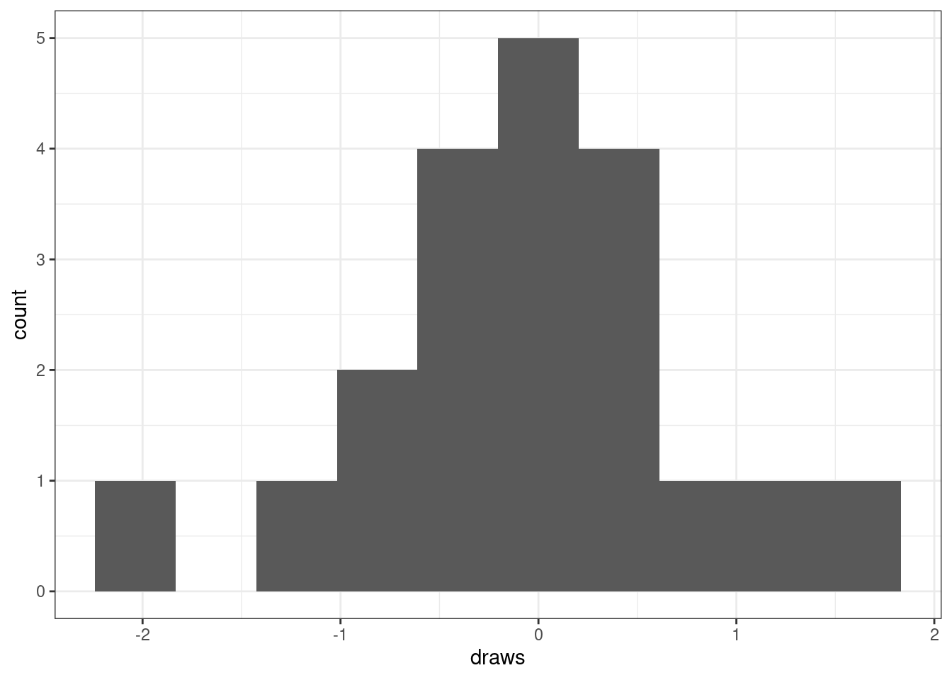
To evaluate normality, it is often helpful to fit the best fitting normal probability density function to the histogram. The best fitting normal probability density function will be the one whose mean and standard deviation matches the sample mean and sample standard deviation of the data.
# Normal random small n plot
ggplot() +
  geom_histogram(
    mapping = aes(
      x = draws,
      y = after_stat(density)), # put histogram on density scale
    bins = 10) +
  stat_function(fun  = dnorm,
                n    = 1001,
                args = list(
                  mean = mean(draws), # match mean of the data
                  sd   = sd(draws)),  # match sd   of the data
color = 'red') 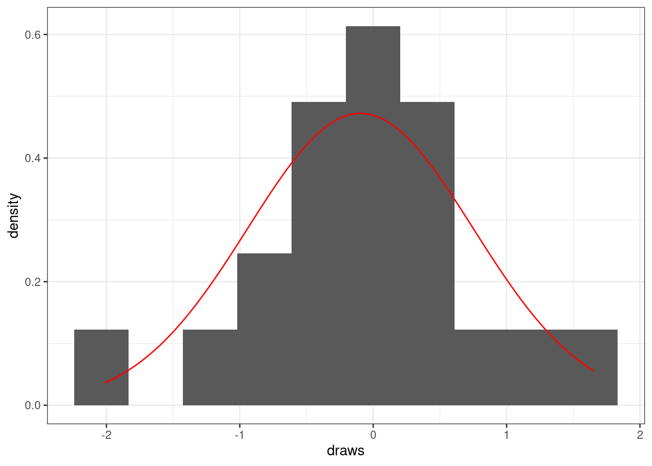
If we have a much larger sample size, the histogram will look approximately normal.
# Normal random draws, big n
draws <- rnorm(1e4)

ggplot() +
  geom_histogram(
    mapping = aes(
      x = draws,
      y = after_stat(density)),
    bins = 30) +
  stat_function(fun = dnorm,
                n = 1001,
                args = list(
                  mean = mean(draws),
                  sd   = sd(draws)),
                color = 'red')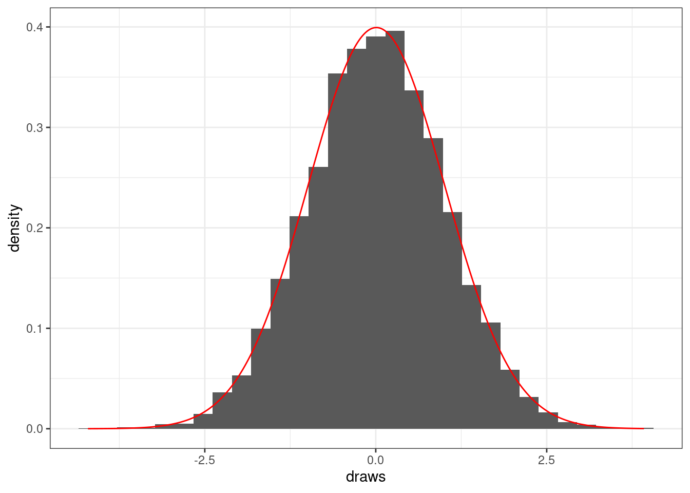
For any given data size, it is helpful to understand how much variability to expect if the data are truly normal. For example, let’s repeatedly simulate 30 normal random variables and visualize their histograms.
# Normal random replicate
n      <- 30
n_reps <- 20

draws  <- data.frame(
  x   = rnorm(n * n_reps),
  rep = rep(1:n_reps, each = n)
)

ggplot(draws,
       aes(x = x)) +
  geom_histogram() +
  facet_wrap(~rep)  +
  scale_x_continuous(breaks = breaks_pretty()) +
  labs(
    title = paste0(n, " Random Normal Draws from N(", mu, ", ", sigma^2, ")"),
    y     = "Count",
    x     = "Value"
  )
`stat_bin()` using `bins = 30`. Pick better value with `binwidth`.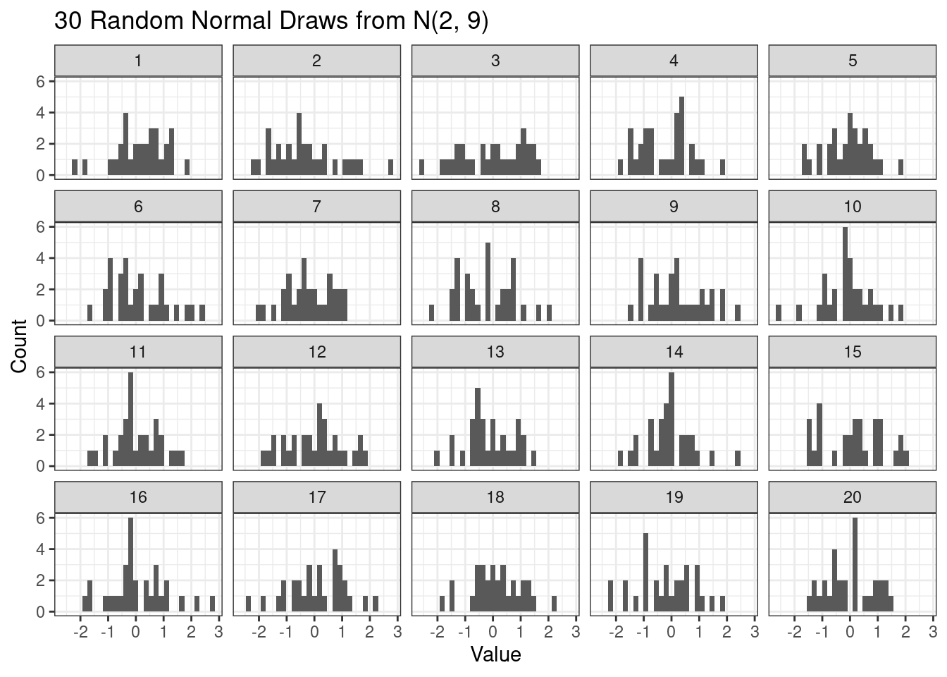
27.2.2 Student’s t
Student’s t distribution naturally arises when working with the normal distribution as a model for data. Specifically, if we have independent data from the same normal distribution, i.e. \(Y_i \stackrel{ind}{\sim} N(\mu,\sigma^2)\) then \[ T = \frac{\overline{Y} - \mu}{S} \sim t_{n-1} \] where \(\overline{Y}\) is the sample mean \[ \overline{Y} = \frac{1}{n} \sum_{i=1}^n Y_i, \] and \(S^2\) is the sample variance \[ S^2 = \frac{1}{n-1} \sum_{i=1}^n (Y_i-\overline{Y})^2. \]
The student t-distribution has a single parameter, the degrees of freedom.
27.2.2.1 Probability density function
The probability density function for a Student’s t-distribution looks like a bell-shaped curve. Compared to the normal probability density function, the Student’s t probability density function is lower in the middle and has heavier (higher) tails.
# Student's t pdf
nu <- 10

d <- data.frame(x = seq(-4, 4, length = 1001)) |>
  mutate(pdf = dt(x, df = nu),
         cdf = pt(x, df = nu))

ggplot(d, aes(x = x, y = pdf)) +
  geom_line() +
  stat_function(fun = dnorm, color = 'gray')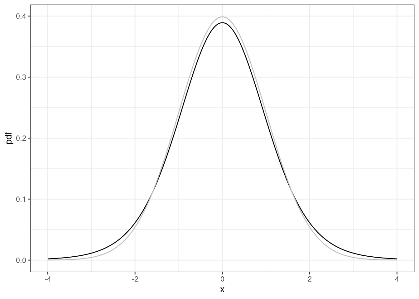
27.2.2.2 Calculative p-values
Suppose you have the following data
# Calculate p-values
y <- round(rnorm(10), 1)
y
[1] -1.8 -0.2 -0.1 -0.4 -0.8 1.4 1.6 1.6 0.0 -0.2which have the following summary statistics
# Summary statistics
# the ; separates R expressions
n <- length(y); n
[1] 10m <- mean(y); m[1] 0.11s <- sd(y); s[1] 1.110005If you are interested in the following hypothesis test: \[ H_0: \mu=1 \quad \mbox{vs} \quad H_A: \mu \ne 1 \] then the test statistic is
# t test statistic
t <- (m-1)/(s/sqrt(n)); t
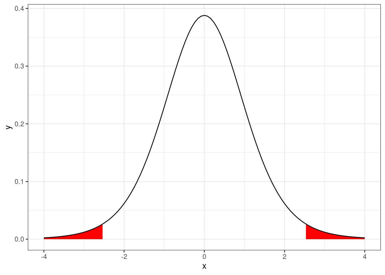
[1] -2.535508Under the null hypothesis, this statistic has a \(t\) distribution with \(n-1\) degrees of freedom. We can then compute the p-value using
# Calculate two-sided p-value
pvalue <- 2*pt(-abs(t), df = n-1); pvalue
[1] 0.03194534We can visualize this p-value as the area under the probability density function of a Student’s t distribution with \(n-1\) degrees of freedom.
xlim <- 4

ggplot(data.frame(x = c(-xlim, xlim)),
       aes(x = x)) +

  # Lower tail
  stat_function(fun  = dt,
                xlim = c(-xlim, -abs(t)),
                args = list(
                  df = n - 1
                  ),
                geom  = "area",
                fill = "red")+

  # Upper tail
  stat_function(fun  = dt,
                xlim = c(abs(t), xlim),
                args = list(
                  df = n - 1
                  ),
                geom  = "area",
                fill = "red") +

  # Density
  stat_function(fun  = dt,
                args = list(
                  df = n - 1
                  ))
27.2.2.3 Critical values
The main use of the quantile function (or inverse CDF) is to compute t critical values for the construction of confidence intervals. For example, a 90% confidence interval based on a Student’s t distribution with \(n-1\) degrees of freedom can be calculated using the following code.
# Critical value
alpha <- 0.1
tcrit <- qt(1-alpha/2,
            df = n-1)

tcrit
[1] 1.833113So a 90% CI for the mean is
# Confidence interval
m + c(-1,1) * tcrit * s / sqrt(n)
[1] -0.533449 0.75344927.3 Summary
Normal, Poisson, and binomial distributions are commonly used for modeling data. Student’s t distribution naturally arises when analyzing normal data with unknown variance, but is seldom used for analyzing data.
