No R script is provided for this content because the R script will not work outside of an R Markdown (or Quarto) document. Thus, it is best to look at the R code on this page.
library("tidyverse"); theme_set(theme_bw())
── Attaching core tidyverse packages ──────────────────────── tidyverse 2.0.0 ──
✔ dplyr     1.1.4.9000     ✔ readr     2.1.5
✔ forcats   1.0.0          ✔ stringr   1.5.1
✔ ggplot2   3.5.1          ✔ tibble    3.2.1
✔ lubridate 1.9.3          ✔ tidyr     1.3.1
✔ purrr     1.0.2
── Conflicts ────────────────────────────────────────── tidyverse_conflicts() ──
✖ dplyr::filter() masks stats::filter()
✖ dplyr::lag()    masks stats::lag()
ℹ Use the conflicted package (<http://conflicted.r-lib.org/>) to force all conflicts to become errors
library("Sleuth3")# Tableslibrary("knitr") # for kablelibrary("kableExtra")
Attaching package: 'kableExtra'

The following object is masked from 'package:dplyr':

    group_rows
Attaching package: 'maps'

The following object is masked from 'package:purrr':

    map
library("sf")
Linking to GEOS 3.11.0, GDAL 3.5.3, PROJ 9.1.0; sf_use_s2() is TRUE
library("tigris")
To enable caching of data, set `options(tigris_use_cache = TRUE)`
in your R script or .Rprofile.
library("leaflet")library("scales")
Attaching package: 'scales'

The following objects are masked from 'package:formattable':

    comma, percent, scientific

The following object is masked from 'package:purrr':

    discard

The following object is masked from 'package:readr':

    col_factor
library("plotly")
Attaching package: 'plotly'

The following object is masked from 'package:formattable':

    style

The following object is masked from 'package:ggplot2':

    last_plot

The following object is masked from 'package:stats':

    filter

The following object is masked from 'package:graphics':

    layout
library("gifski")
Rmarkdown documents that produce HTML files can include a variety of features that provide an interactive document for the user. Primarily this interactivity is implemented as will concern stand-alone tables, figures, and animations (movies). Typically this interactivity is available via an R package interface to a javascript library.
We’ll take a look at the construction of tables using the knitr, formattable, and DT packages. Technically, the first two packages provide non-interactive tables while the third provides interactivity. But we’ll start with the first two as they provide some nice functionality to make nice looking HTML tables.
10.1 Tables
We will take a look at the diamonds data set.
dim(diamonds)
[1] 53940 10
These data are too large for interactive scatterplots and thus we will take a random sample of these data.
10.1.1 kable
The kable() function in the knitr package provides an easy display of tables in an HTML document.
By default, the kable function will show the entire table. So, let’s just show the first few lines.
d <- diamonds |>group_by(cut) |># ensure we have all cuts for groupingsample_n(3)d
# A tibble: 15 × 10
# Groups:   cut [5]
   carat cut       color clarity depth table price     x     y     z
   <dbl> <ord>     <ord> <ord>   <dbl> <dbl> <int> <dbl> <dbl> <dbl>
 1  0.9  Fair      H     SI1      66.8    55  3145  5.98  5.9   3.97
 2  2.22 Fair      G     SI2      64.4    58 12508  8.32  8.15  5.3
 3  2.01 Fair      H     SI2      64.9    56 10184  7.88  7.81  5.09
 4  1.02 Good      D     SI2      57.5    62  3909  6.62  6.6   3.8
 5  1    Good      G     VS2      63.8    59  5148  6.26  6.34  4.02
 6  1.01 Good      G     VVS2     62.4    61  7137  6.34  6.38  3.97
 7  0.51 Very Good D     SI1      63.5    55  1574  5.09  5.08  3.23
 8  0.41 Very Good E     SI1      62.9    57   755  4.73  4.78  2.99
 9  1.02 Very Good D     VS2      63.9    59  6447  6.29  6.33  4.03
10  1.8  Premium   I     SI1      61.9    60 11948  7.78  7.74  4.8
11  0.39 Premium   J     VS2      61.3    60   746  4.68  4.65  2.86
12  1.21 Premium   G     SI2      60.3    58  5529  6.96  6.9   4.18
13  0.63 Ideal     E     VVS2     61.6    57  2697  5.52  5.49  3.39
14  0.51 Ideal     H     VS2      60.8    57  1442  5.14  5.16  3.13
15  0.54 Ideal     E     SI1      61.3    56  1422  5.22  5.25  3.21
Also, by default, the table looks pretty bad, so let’s add some styling.
<span style=" color: blue !important;" >3145</span>
5.98
5.90
3.97
<span style=" color: red !important;" >2.22</span>
Fair
G
SI2
64.4
58
<span style=" color: black !important;" >12508</span>
8.32
8.15
5.30
<span style=" color: red !important;" >2.01</span>
Fair
H
SI2
64.9
56
<span style=" color: black !important;" >10184</span>
7.88
7.81
5.09
<span style=" color: red !important;" >1.02</span>
Good
D
SI2
57.5
62
<span style=" color: blue !important;" >3909</span>
6.62
6.60
3.80
<span style=" color: red !important;" >1</span>
Good
G
VS2
63.8
59
<span style=" color: black !important;" >5148</span>
6.26
6.34
4.02
<span style=" color: red !important;" >1.01</span>
Good
G
VVS2
62.4
61
<span style=" color: black !important;" >7137</span>
6.34
6.38
3.97
<span style=" color: black !important;" >0.51</span>
Very Good
D
SI1
63.5
55
<span style=" color: blue !important;" >1574</span>
5.09
5.08
3.23
<span style=" color: black !important;" >0.41</span>
Very Good
E
SI1
62.9
57
<span style=" color: blue !important;" >755</span>
4.73
4.78
2.99
<span style=" color: red !important;" >1.02</span>
Very Good
D
VS2
63.9
59
<span style=" color: black !important;" >6447</span>
6.29
6.33
4.03
<span style=" color: red !important;" >1.8</span>
Premium
I
SI1
61.9
60
<span style=" color: black !important;" >11948</span>
7.78
7.74
4.80
<span style=" color: black !important;" >0.39</span>
Premium
J
VS2
61.3
60
<span style=" color: blue !important;" >746</span>
4.68
4.65
2.86
<span style=" color: red !important;" >1.21</span>
Premium
G
SI2
60.3
58
<span style=" color: black !important;" >5529</span>
6.96
6.90
4.18
<span style=" color: black !important;" >0.63</span>
Ideal
E
VVS2
61.6
57
<span style=" color: blue !important;" >2697</span>
5.52
5.49
3.39
<span style=" color: black !important;" >0.51</span>
Ideal
H
VS2
60.8
57
<span style=" color: blue !important;" >1442</span>
5.14
5.16
3.13
<span style=" color: black !important;" >0.54</span>
Ideal
E
SI1
61.3
56
<span style=" color: blue !important;" >1422</span>
5.22
5.25
3.21
10.1.2 formattable
Another function is formattable() in the formattable package. The default table is reasonable.
d |>
  formattable::formattable()
carat
cut
color
clarity
depth
table
price
x
y
z
0.90
Fair
H
SI1
66.8
55
3145
5.98
5.90
3.97
2.22
Fair
G
SI2
64.4
58
12508
8.32
8.15
5.30
2.01
Fair
H
SI2
64.9
56
10184
7.88
7.81
5.09
1.02
Good
D
SI2
57.5
62
3909
6.62
6.60
3.80
1.00
Good
G
VS2
63.8
59
5148
6.26
6.34
4.02
1.01
Good
G
VVS2
62.4
61
7137
6.34
6.38
3.97
0.51
Very Good
D
SI1
63.5
55
1574
5.09
5.08
3.23
0.41
Very Good
E
SI1
62.9
57
755
4.73
4.78
2.99
1.02
Very Good
D
VS2
63.9
59
6447
6.29
6.33
4.03
1.80
Premium
I
SI1
61.9
60
11948
7.78
7.74
4.80
0.39
Premium
J
VS2
61.3
60
746
4.68
4.65
2.86
1.21
Premium
G
SI2
60.3
58
5529
6.96
6.90
4.18
0.63
Ideal
E
VVS2
61.6
57
2697
5.52
5.49
3.39
0.51
Ideal
H
VS2
60.8
57
1442
5.14
5.16
3.13
0.54
Ideal
E
SI1
61.3
56
1422
5.22
5.25
3.21
d |># Conditional highlightingmutate(carat =cell_spec(carat, "html", color =ifelse(carat > .7, "red", "black")),price =cell_spec(price, "html", color =ifelse(price <5000, "blue", "black")) ) |> formattable::formattable(list(# Width depends on proportion from 0 to max valuex =color_bar("#C8102E"), y =color_bar("#C8102E"), z =color_bar("#C8102E"), # Color depends on proportion from min to max valuedepth =color_tile("#CAC7A7","#524727") ) )
carat
cut
color
clarity
depth
table
price
x
y
z
0.9
Fair
H
SI1
66.8
55
3145
5.98
5.90
3.97
2.22
Fair
G
SI2
64.4
58
12508
8.32
8.15
5.30
2.01
Fair
H
SI2
64.9
56
10184
7.88
7.81
5.09
1.02
Good
D
SI2
57.5
62
3909
6.62
6.60
3.80
1
Good
G
VS2
63.8
59
5148
6.26
6.34
4.02
1.01
Good
G
VVS2
62.4
61
7137
6.34
6.38
3.97
0.51
Very Good
D
SI1
63.5
55
1574
5.09
5.08
3.23
0.41
Very Good
E
SI1
62.9
57
755
4.73
4.78
2.99
1.02
Very Good
D
VS2
63.9
59
6447
6.29
6.33
4.03
1.8
Premium
I
SI1
61.9
60
11948
7.78
7.74
4.80
0.39
Premium
J
VS2
61.3
60
746
4.68
4.65
2.86
1.21
Premium
G
SI2
60.3
58
5529
6.96
6.90
4.18
0.63
Ideal
E
VVS2
61.6
57
2697
5.52
5.49
3.39
0.51
Ideal
H
VS2
60.8
57
1442
5.14
5.16
3.13
0.54
Ideal
E
SI1
61.3
56
1422
5.22
5.25
3.21
10.1.3 DT
As we will see, with the pagination, datatable() provides the capability to succinctly display much larger tables. So we will use more data
In this section, I am combining graphics, i.e. plots, as well as maps and animations (movies).
10.2.1 Plots
There are a variety of approaches to including interactivity in graphics in rmarkdown documents. We’ll focus on using the plotly library and specifically the ggplotly() function which provides interactivity for ggplot2 created graphics.
10.2.1.1 plotly::ggplotly()
The ggplotly() function from the plotly package provides interactivity for (all?) ggplot2 constructed graphics. The interactivity provide allows the user to
resize (zoom, rescale, reset)
pan
hover (show vs compare)
toggle spike lines
download
10.2.1.1.1 Boxplot
g <-ggplot(case0501, aes(x = Diet, y = Lifetime)) +geom_boxplot() +coord_flip()ggplotly(g)
10.2.1.1.2 Histogram
g <-ggplot(diamonds, aes(x = price)) +geom_histogram(bins =100)ggplotly(g)
10.2.1.1.3 Scatterplot
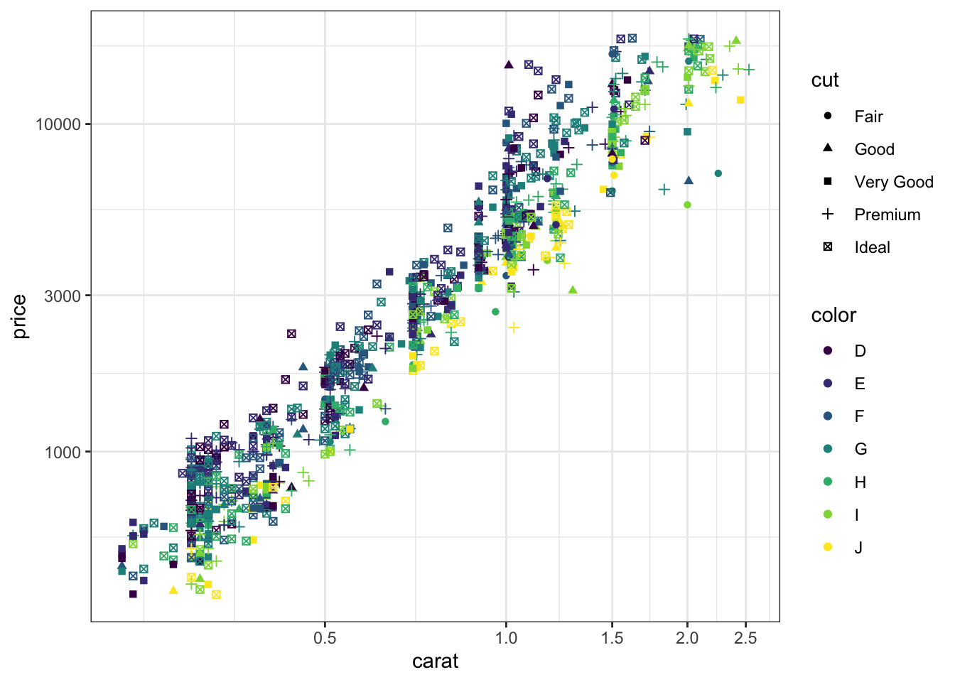
Here is a static plot of the diamonds data set.
d <- diamonds |>sample_n(1000)g <-ggplot(d, aes(x = carat, y = price,shape = cut,color = color)) +geom_point() +scale_y_log10() +scale_x_log10(breaks = scales::breaks_pretty()) g
Warning: Using shapes for an ordinal variable is not advised
ggplotly(g)
Warning: Using shapes for an ordinal variable is not advised
Another package from constructing interactive graphics is dygraphs.
10.2.2 Maps
10.2.2.1 ggplot2()
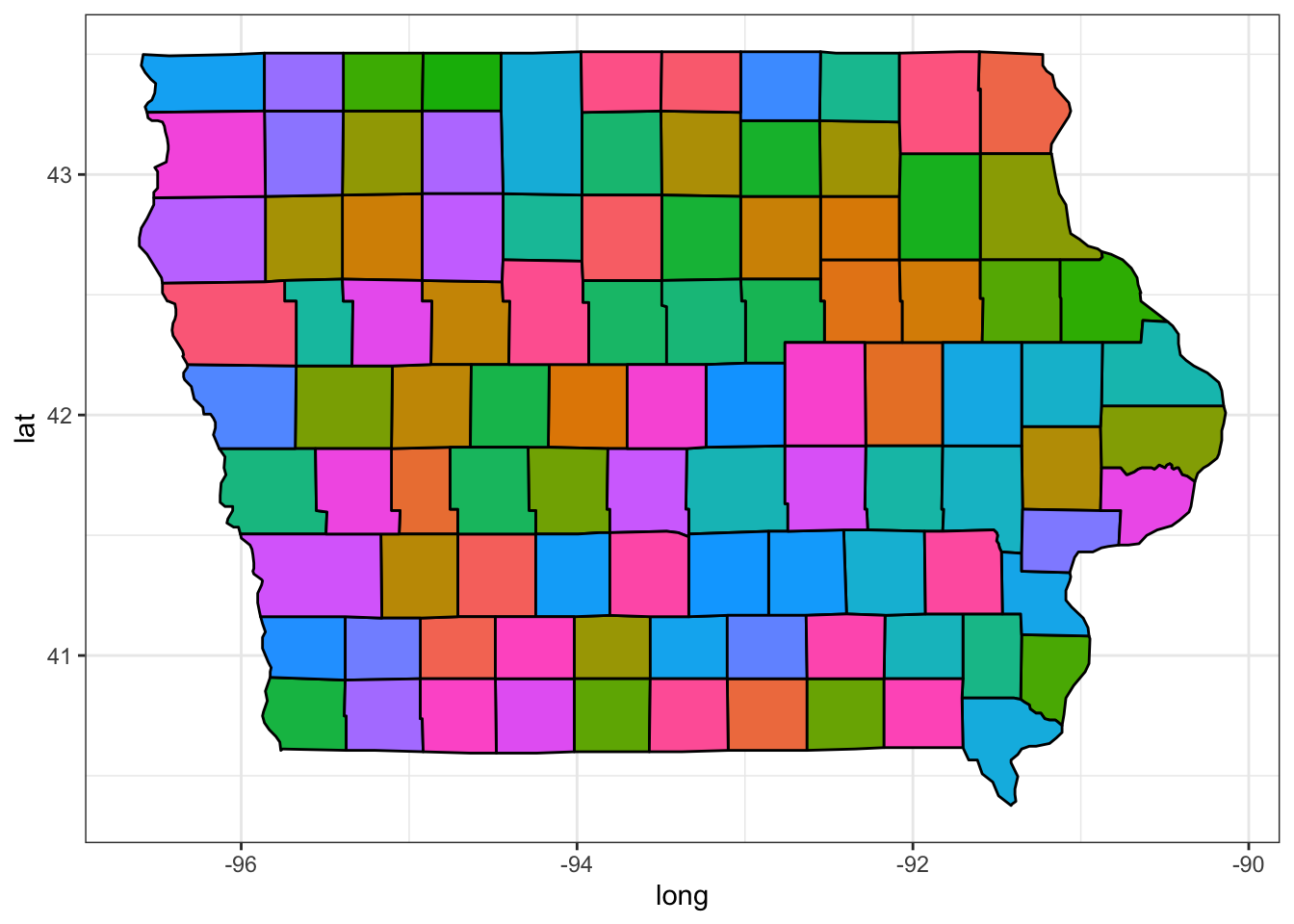
Maps can be drawn with ggplot2, but these are not interactive.
ggplot(map_data("county","iowa"), aes(x = long, y = lat, fill = subregion)) +geom_polygon(color ="black") +guides(fill ="none")
10.2.2.2 leaflet()
An open source R package and JavaScript library for mobile-friendly interactive maps is LeafLet.
World map:
leaflet::leaflet() |>addTiles()
In order to set the view, you will need the latitude (y) and longitude (x) in decimal format. I typically use Google maps, but there are other options, e.g. LatLong.net.
Here is Ames:
leaflet::leaflet() |>addTiles() |>setView(lng =-93.65, lat =42.0285, zoom =12)
You can always embed additional interactivity through the use of an iframe. To get this to work, you need to add the option data-external="1" to the iframe options.
For example, here is a google map.
Here is an embedded video of mine from YouTube discussing the Gibbs sampler demonstrated above.